
We need better communication.
Our needs as transit riders are getting lost in the politics of the MTA. But riders’ needs are important and we need better communication from the MTA.To be effective communicators, the MTA needs to be clear, consistent and brief in their messaging and strategic about the dissemination of those messages.
I joined the 7 Train Blues℠ steering committee to share insight on how the MTA can use design and user experience fundamentals to alleviate some of our transit frustrations. 7 Train Blues℠ members on Facebook tell us that they’re frequently left stranded with little to no communication after long periods of waiting on the platform and that the MTA’s communications are confusing.
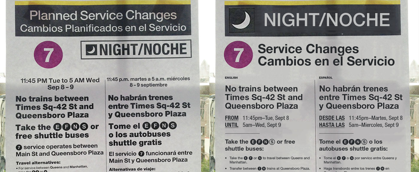
Part of the issue lies with the service change posters that are often inconveniently displayed in areas that require riders to travel up flights of stairs to the station or even swipe Metrocards to get through the turnstile before they can be seen. While this may not seem like an issue, it affects customers travelling with small children and those riders with disabilities.
Last month, I experimented with the design and content of a planned service change poster in Photoshop. The original was rather confusing because of it contained dense text and awkward phrasing. By rearranging some of the information and cutting back on the language, the poster seems to be much clearer.
The service announcements are also another issue. While the automated announcements added to the 7 line were a huge improvement for regular service, they don’t always reflect reality. In some cases, the next train is announced to arrive in two minutes, but doesn’t show up for 10. There are times when no announcements of service delays are made at all, leaving customers left waiting on the platform.
This raises the question of the flow of information from the time of an incident to when customers find out about it. There seems to be a big gap in between, which makes it harder for us to make decisions and reroute our commutes. Even train operators seem to be given vague information from the control centers. This is where 7 Train Blues℠ saves the day because other riders post real-time updates on Facebook about what’s going on, before the MTA is even comes close to telling us.
Incremental improvements have been made, though sometimes those changes don’t last. In 2008, the MTA launched the red diamond and green circle concept to help riders discern local trains from the expresses, but people are still confused today. The newer train models (the R188s), while a huge leap forward, have visual inconsistencies from the red and green symbols on the R62As that regular riders are familiar with.
The R188s still show the diamond and circle, but only at the front of the train, and both are now red. Riders have to depend on catching a glimpse of the R188’s digital side panels that don’t always show what the train is and are often glitchy. Plus, the Lcl and Exp drops from the second screen. From a communication standpoint, we should see Lcl or Exp at all times, especially when trains can suddenly switch from being local to express at the station.
Perhaps there are major budget considerations for rethinking the signage on the train, but the MTA can improve the written communications and make accurate and prompt announcements at little to no cost. It’s just a matter of thinking about the riders and our needs.
The bottom line is that the MTA is a brand that provides an experience. As customers, we are the ones having the experience, good, bad or otherwise. When the MTA begins to hold our experience with value, we’ll start to see improvements.
The author is a founding steering committee member of 7 Train Blues℠ on Facebook and www.AccessQueens.org.